*UPDATE - [we just discovered an Instagram called @supremecopies which would have added an entire layer of discussion to this article. There are over 400 posts of alleged Supreme bites, however they are affectionately referred to as 'inspiration'. These have not been 'verified' by us but it's interesting viewing to say the least.]
No doubt the biggest cultural phenomenon to hit skateboarding and streetwear culture in recent years is the rise of Supreme. Valued at 1 Billion Dollars, the brand has came from humble beginnings to become an absolute juggernaut in todays youth culture. It's no doubt impressive, and we have a great deal of respect for the brand and what they have accomplished (Tyshawn Jones part in "BLESSED" has been on repeat around here).
As 90's skateboarders we grew up in the culture that birthed them and perhaps understand some of the subtle nuances of that time period, and were curious if todays average fan had any connection to that era. It is widely known that the coveted Supreme Box Logo (or BOGO) was inspired by the works of artist Barbara Kruger (not a fan of Supreme). This is nothing shocking, in the 90's skate logo's and graphics were almost exclusively derived from existing works. Calvin Klein, Gucci, and Louis Vuitton derived graphics were used so much it would be impossible to locate them all, and those are just to name a few. Baseball teams, restaurants, soft drinks, airlines, automobiles, fast food chains, gas stations, you name it, skateboarding had it's way with it.
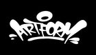
So what started innocently enough for us became a fascinating social experiment. We decided to do the unthinkable and place a red rectangle around our typeface for a small run of hoodies.
 The Artform Social Experiment Hoodie
The results were fascinating. We soon began getting a bit of backlash from some die hard Supreme fans. Apparently many of todays fans are oblivious to Los Angeles based Kruger (who currently has a running exhibition at The Geffen Contemporary at MOCA). Our own fans responded well to the hoodie nonetheless with no deviation in sales patterns. The garments are well made we've had numerous repeat purchases in different color ways.
The backlash seemed interesting to us because graphically it's simply our logo with a red rectangle. If we wanted to duplicate the Supreme logo it's not incredibly difficult, I believe it's Futura Bold Oblique and a red rectangle. Perhaps the communication might have been better directed toward the Italian 'Supreme' that's working on collaborating with Samsung and opening stores in China.
Culturally this is very significant for such a large group of people to be so passionate about a derivative piece of artwork (Supremes logo being a derivative of Kruger's work). I don't know if anyone would be that passionate about some of the most famous logos in the world, which are non-derivative original works. Nike, Apple? This is no doubt the type of brand value that the controversial Carlyle Group saw when they injected an unprecedented 500 million dollars into the Skate/Streetwear brand.
To again clarify we are fans of Supreme, and fans of Barbara Kruger's works, and wish nothing but the best for both of them. For reference please see the diagram below.
 Supreme Logo (top), Barbara Kruger Art (bottom)
0 comments